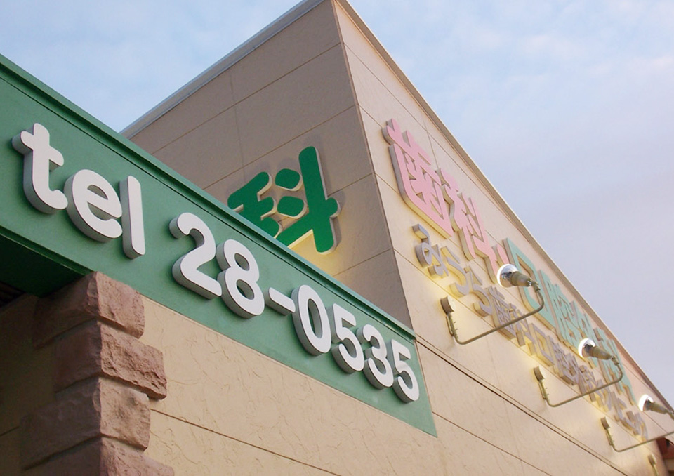
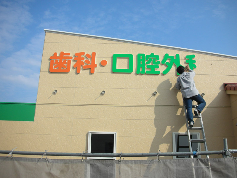
新規開店される歯科の切文字を製作させて頂きました。
建物が大きい場合に考えることは道路側からの視認性と歩行者からの視認性を考えています。
文字が大きいと近くからはあまり視認性がよくありません。逆に遠くから小さい文字は読めません。
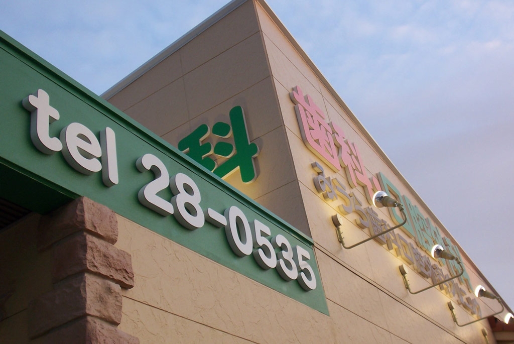
この場合、立地環境も考慮して文字サイズ・色等を決めます。
人よりも車の方が多いとかまた他のビルで死角になっていないかなど他にクライアントが「シンプルにして欲しい」との要望でしたら近くに似たような色使いの看板は無いかなども考慮します。
病院関係などではスポットライトはレフ(電球色)は使わず水銀灯を用います。建物全体が明るくなり歩道も明るくなるので地域の方にも喜んで頂けます。
I was reading some of your posts on this site and I conceive this website is rattling instructive!
Retain putting up.Money from blog
UGC Success Collection ! The UGC Premium Collection is the ultimate resource for capitalizing on the skyrocketing trend of User-Generated Content. Packed with detailed guides, mini courses, and fully editable, resellable products, this collection empowers Master Reseller License Holders to create, customize, and sell high-demand digital assets to a global audience. Whether you’re helping your customers build their brands or monetize their creativity, this collection has everything you need to stay ahead of the curve. ACCESS COLLECTION here: http://digital-products.advertising4you.co.uk